Content Visual Quick Guides
Content Visual Quick Guides
Visual quick guides
Articles or Paragraphs
The only required field is the WYSIWYG text. You have the option of adding headings or a "call to action" button after the text area.
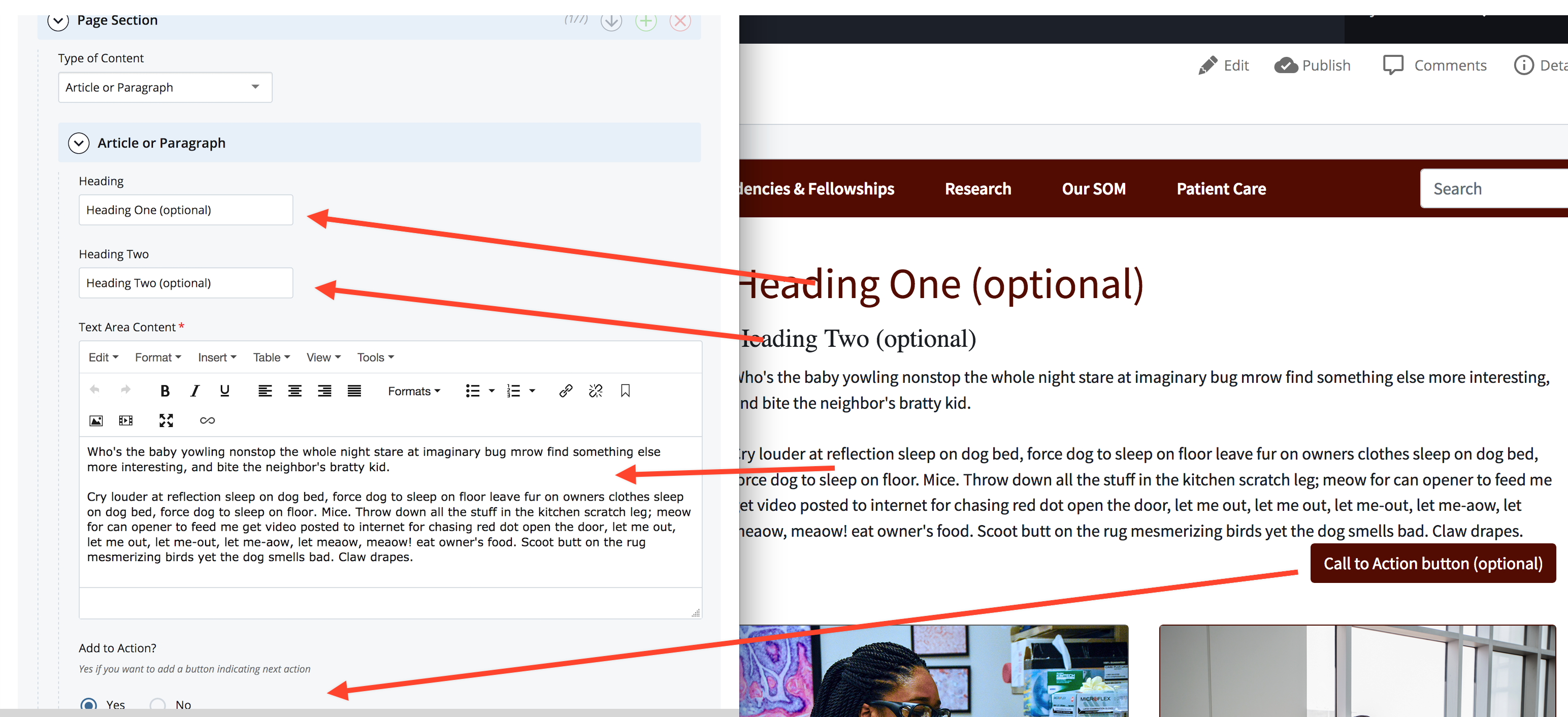
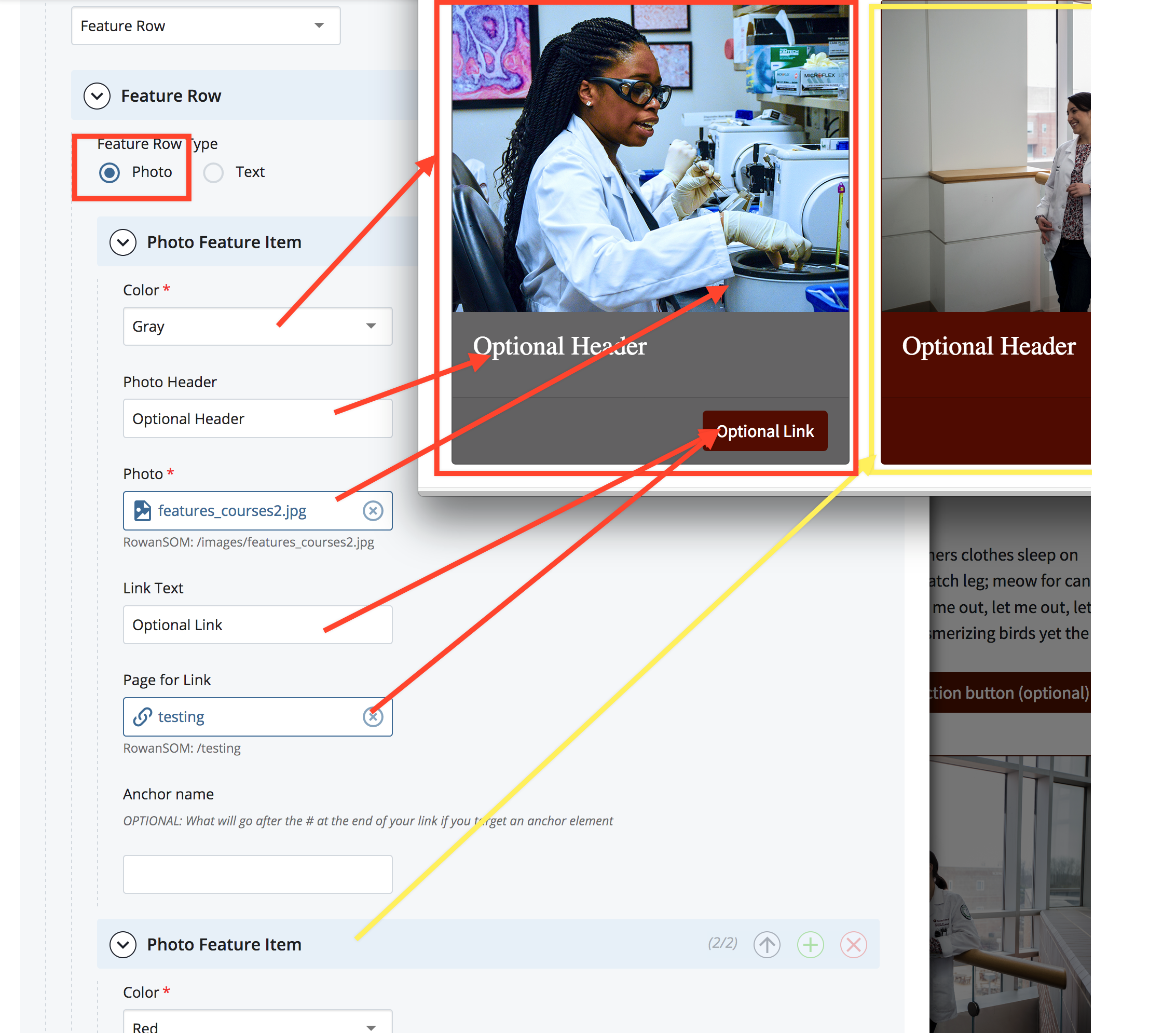
Photo Features
You need to add a new item for each photo box. Inside each item you choose the background color, the picture and, optionally, a heading and a link to more content.
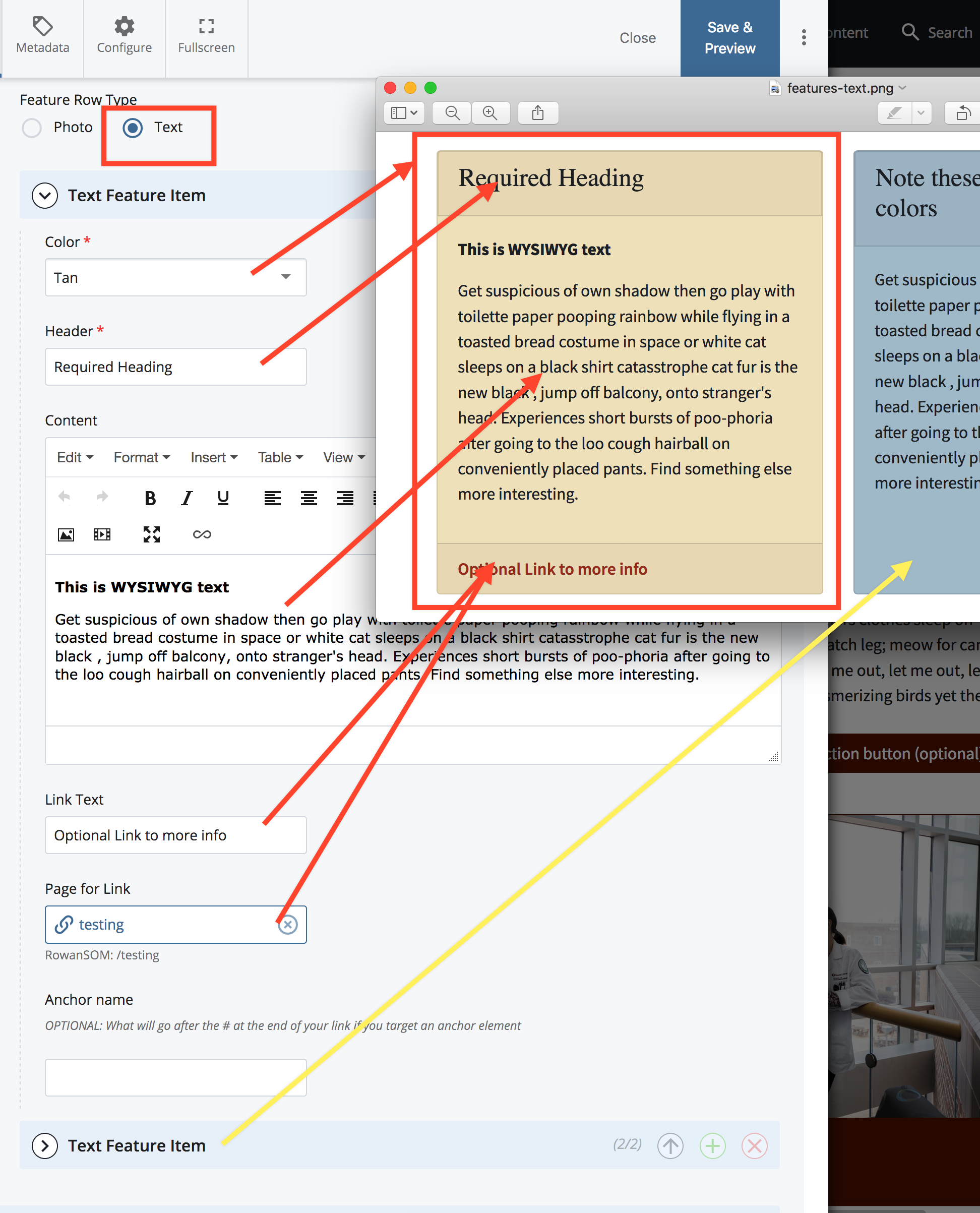
Text Features
All Text Features need to have a title/heading and a WYSIWYG area. You may also include a link to other content.
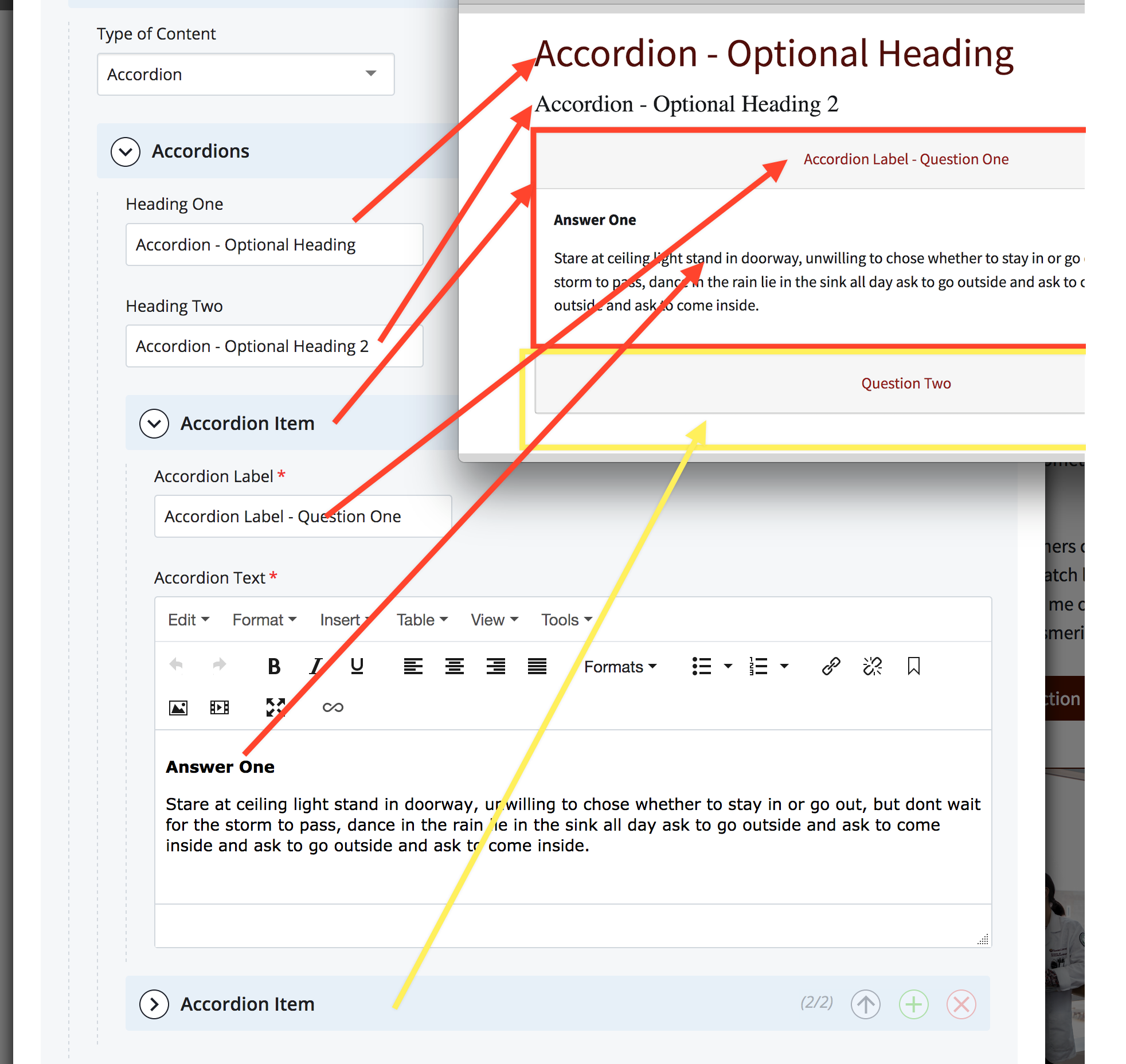
Accordions
Sections or groups of accordion items can have two levels of headings. Beneath that each expanding section (Accordion Item) must have a "Label" that serves to open the section, and the item content your user can see that content.
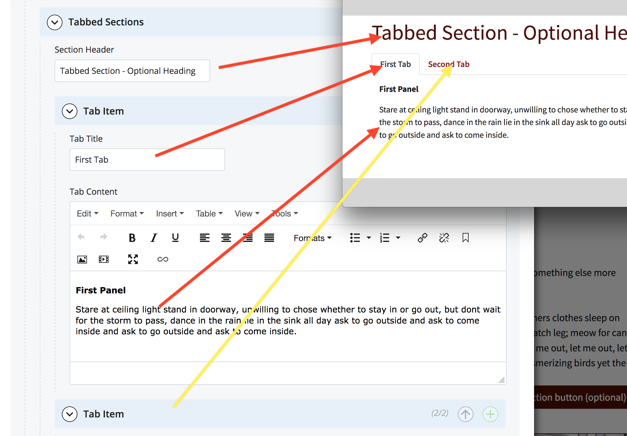
Tabbed sections
Tabbed panels may have a heading, but each tab must have a "Tab Title" and "Tab Content."
Web Services
Main Menu
- Web Services
- University Web Services Policy
- Cascade Editor Guide
- Web Analytics Documentation
- Project Request Form
- Rowan Cascade Documentation
- Logging In
- Editing a current page
- How the Left Hand Navigation Works
- Creating New Pages
- Adding Content Sections
- Adding Other Content
- Starting a New Site
- Submitting & Publishing
- Getting Started with Cascade Blogs
- RSS Feeds and News Pages
- Images
- Troubleshooting
- Communication & Collaboration
- Accessibility
- SOM - Cascade Documentation
- Website Ambassadors
- Contact Us