How to make the image fit
How to make the image fit
So you have a picture, but it does weird things when you add it to the feature or the banner area. Learn about Aspect Ratios!
Basic Vocabulary
- Frame: an area on the page that is fixed by the site for displaying a banner or image.
- Aspect Ratio: the proportion of width to length of a frame or an image.
- Pixel: the unit we use to measure digital images.
About Frames
If you try to put an image into a frame that does not match the aspect ratio of the frame, the frame can:
- Try to force your picture into the ratio it is supposed to be and distort the image.
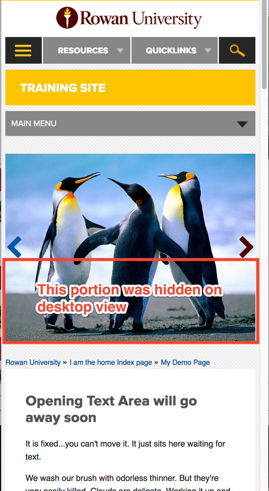
- Fit it to either height or width and then let the rest overflow or hide it with the frame.
- Imagine holding a frame over a picture that fits one dimension, but not the other. Whatever falls outside of the frame won’t be seen (but it still exists!). This is “hidden overflow”
- If your image is too small for the fixed dimension. It will stretch it to fit in that one direction (Imagine holding a frame that is too big over an image, then stretching the picture either up or across to make it fit in just one direction. What happens to the image itself?)
Banners on the Rowan site
- Ratio of the frame for banners = 430:187 (But the actual size in pixels can go much higher. See next item)
- Banner images:
- Shrink to fill the entire width of the frame
- After filling the width, the frame will
- Align the top of the image to the top of the frame and
- Hide any part of the image that falls beneath the frame.
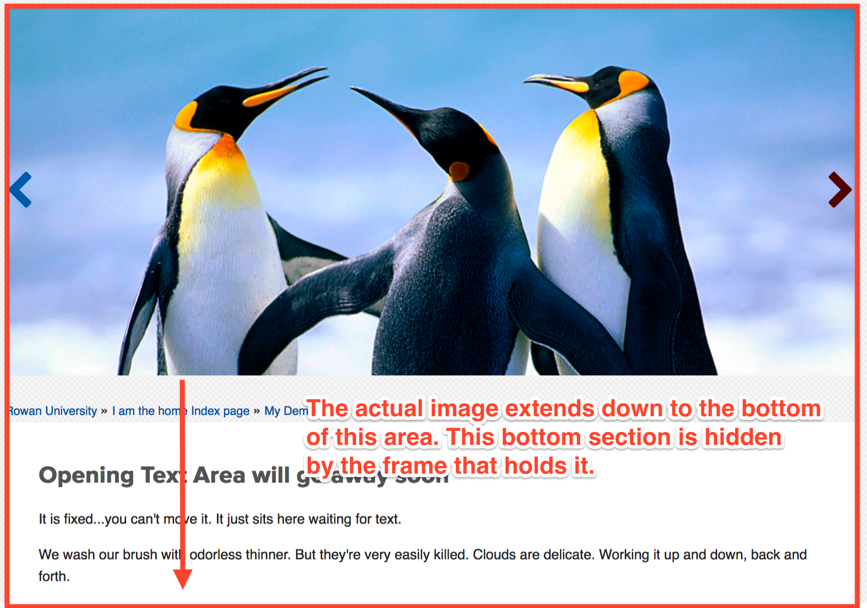
- NOTE: Some folks like the way their banners get cropped by the frame and do nothing to change it. This can work to your advantage on the mobile view because the rest of the image will be exposed there! Others will opt to crop it themselves to the same aspect ratio so they can control what gets cut off and what doesn’t.
- On larger screens the maximum width will be 860px so you should make sure to make your image is at leastthat wide or wider.
- A perfectly fitting image on the largest screen possible is 860px x 374px.
Features
Features are the boxes you can add to the page to feature items in your site.
The frames for features will
- Shrink the image to fit the width of the frame AND will allow it to extend to the full height of the aspect ratio. (NOTE: this is different from your banner which will hide the overflow)
So:
- First and foremost, keep all feature images at least 415px wide no matter whether you set them up for 2 or 3 features per row. (This way if you ever switch a 3 feature row to a 2 feature row, your pics will still work in a screen at the widest width )
- Then even if your pics are different widths:
- Use an aspect ratio calculator to make sure that the proportion of height to width is the same. (You can find one here: https://andrew.hedges.name/experiments/aspect_ratio/).
- Just feed in your height and width of your model image in the first boxes, and it will give you your aspect ratio
- Enter the width of your new image, and it will tell you what height you need to crop it to in order for it to match when displayed in the frame.
- Use those numbers in fotor.com to crop to the same aspect ratio just as you did for your banner above.