Guide for Accessibility
Guide for Accessibility
Accessibility at Rowan: What Faculty Need to Know
Rowan University is committed to making its websites and course materials accessible to all users. This is both best practice from a pedagogical perspective and consistent with legal requirements. In accordance with Title II of the Americans with Disabilities Act, the University requires its web content to meet the Web Content Accessibility Guidelines, version 2.1, Level AA. The University strives to create accessible content from the beginning, rather than retrofitting content later. For more information, see the Digital Accessibility Policy (adopted 2/19/2026).
Accessibility is not just about compliance, it’s about making sure all students can fully participate, engage, and succeed in your course.
Why This Matters
Accessible content helps:
- Students who use screen readers or other assistive technologies
- Students with visual, hearing, cognitive, or learning differences
- Students accessing content on mobile devices or in different environments
- All students, by improving clarity, organization, and usability
Good accessibility is simply good teaching.
What’s Required
Beginning April 26, 2027, in compliance with Title II of the Americans with Disabilities Act, Rowan’s digital content must align with the WCAG 2.1 Level AA standards.
This applies to:
- Canvas course materials
- Documents (Word/Docs, PowerPoint/Slides, Excel/Sheets, PDFs, etc.)
- Videos and multimedia
- Department or program webpages
- University associated social media pages
- Any digital content used in teaching or University activities
What This Means for You
You are not expected to fix everything overnight. Instead, focus on:
- New Content First: Make anything you create going forward accessible.
- Improve What You Use Most by prioritizing materials that are:
- Used frequently
- Required for assignments or participation
- Core to student learning
- Use Available Tools you already have tools that help:
- Accessibility checkers (Microsoft, Grackle, Adobe, Canva)
- Accessibility features and captioning tools (Zoom, Teams, Kaltura)
- Built-in formatting tools
Accessibility 101: Rowan Digital Accessibility Quick Checklist
Creating accessible digital content helps ensure that all members of the Rowan community, including students, faculty, staff, and visitors, can access information clearly and effectively. Accessible design improves usability for everyone, including people using assistive technologies, mobile devices, or viewing materials in challenging environments. Accessibility is an ongoing process. The following practices highlight simple steps you can take when creating documents, course materials, webpages, and presentations.
General Best Practices
- Use clear, simple language whenever possible.
- Use readable fonts and consistent formatting throughout your content.
- Run built-in accessibility checkers in the tools you use to create materials.
- Use descriptive file names and titles that reflect the content.
- Work in the native format of your document editor or platform when possible.
Headings and Structure
- Organize content using built-in heading styles.
- Follow a logical hierarchy (Heading 1 → Heading 2 → Heading 3).
- Avoid skipping heading levels.
- Use built-in list tools for bullets and numbered lists.
- Avoid using bold text, underlining, or all caps to create visual headings.
Color and Contrast
- Ensure sufficient color contrast between text and background.
- Do not rely on color alone to convey meaning.
- Use simple backgrounds behind text.
- Avoid placing text on busy images or patterns.
Images
- Provide alt text for images that convey information.
- Mark decorative images as decorative.
- Write alt text to communicate the purpose of the image, not just what it looks like.
Multimedia
- Caption all videos used in digital content.
- Review and correct automatically generated captions.
- Provide transcripts for audio recordings.
- Describe important visual information (charts, graphs, demonstrations) when presenting content.
Links and Navigation
- Use descriptive link text rather than phrases like “click here.”
- Ensure links make sense when read out of context.
- If a link opens a file or new window, provide a brief note in the link text.
Tables and Data
- Use tables only for structured data, not layout.
- Provide row and column headers.
- Avoid merged or split cells when possible.
- Include captions for tables when needed.
- Clearly label charts and graphs.
- Every data cell should be associated with a row or column header.
Top 5 Ways Faculty Can Make Their Courses Accessible Now
Making courses more accessible can feel overwhelming, but many improvements are quick and easy to implement. By using the accessibility tools built into common software and making a few thoughtful choices when creating course materials, faculty can remove common barriers and make learning more accessible for all students. The following practices are some of the most effective steps instructors can take right now.
1. Use Built-In Accessibility Checkers
Before posting documents, run the accessibility checker in the tool you used to create the file. These tools identify common issues such as:
- Missing alt text
- Improper heading structure
- Table formatting problems
- Color contrast issues
This is often the fastest way to find and fix problems.
2. Use PDFs Carefully
PDFs can be much harder to remediate than the original document.
Best practice:
- Create content in Word, Google Docs, or HTML first
- Make it accessible there
- Then export to PDF if needed and check accessibility
Why this matters:
- Accessibility is easier to fix in the source document
- Untagged PDFs and scanned PDFs are very difficult to repair later
3. Add Alt Text to Images, Graphs, and Diagrams
Alt text allows screen readers to describe images. Focus on the purpose of the image, not every detail.
Example:
“Graph showing enrollment increasing from 2019 to 2023.”
This is especially important for:
- Charts
- diagrams
- screenshots
- instructional images
If an image is just for decoration, mark it as decorative. This ensures a user accessing a document with a screen reader is not missing meaningful information.
4. Use Clear Structure
Make content easier to navigate by applying built in heading structures in word processing by using:
- Heading styles (Heading 1, Heading 2, etc.)
- Lists instead of long paragraphs
Bolding and changing fonts alone do not set the structure. Indicate the heading type to help users navigate the document.
5. Use Descriptive Links
Write meaningful text for hyperlinks that describe the destination.
- Avoid: “Click here”
- Use instead: “Download the assignment instructions.”
Using Accessibility Checkers
Accessibility checkers are built into many tools you already use, such as Microsoft Word, PowerPoint, Excel, Adobe Acrobat, and Google Docs (via tools like Grackle). These checkers quickly identify common accessibility issues and provide guidance on how to fix them. Accessibility checkers are a starting point. They help you catch common errors, but they do not replace thoughtful design and review. Running an accessibility checker is one of the fastest ways to improve accessibility right away.
Using Accessibility Checkers helps:
- Identify missing alt text, poor structure, and contrast issues
- Improve navigation for screen reader users
- Ensure documents meet basic accessibility standards
- Save time by catching issues early
What Accessibility Checkers Do NOT Catch:
- Whether alt text is meaningful or accurate
- Whether link text is descriptive
- Whether content is clear and understandable
- Whether images need descriptions in context
These require human judgment and review.
How to Access the Accessibility Checker in Different Platforms
Microsoft Suite (Word, PowerPoint, Excel, Outlook, OneNote)
To run the Microsoft Accessibility Checker:
- Select the Review tab
- Click Check Accessibility
The checker will open a panel showing:
- Errors (must be fixed)
- Warnings (should be reviewed)
- Tips for improving accessibility

Click on each issue to see why it matters and how to fix it.
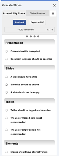
To use Grackle:
- Install the Grackle Extension (Doc, Slides and Sheets)
- Open the extension and run a check (Extensions → Grackle → Launch)
- Review flagged issues and follow suggested remediations
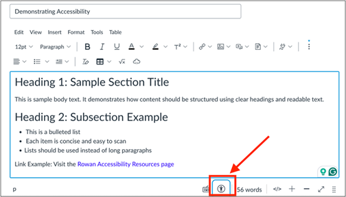
To run the Accessibility Checker in Canvas LMS while editing textboxes such as Announcements or Pages:
- Click the accessibility icon located at the bottom of the text box.
- From the panel, review the identified accessibility errors and correct them until there are no errors.
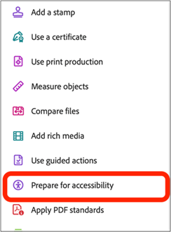
To run the Adobe Acrobat accessibility checker on a PDF:
- Open PDF in Acrobat
- Go to All Tools → More→ Prepare for Accessibility
- Select Automatically Tag PDF
- This will tag all elements. Unlike a document, PDF’s tag individual elements such as tables, figures, lists, list items, quotations, etc. Reviewing the structure manually is still required to confirm auto tagging is correct.
- After structure is confirmed, Check for Accessibility. Settings, including review preferences can be set. elect all for review.
- The accessibility panel will appear on right reviewing document for features.
- Review report and rectify any errors following suggestions
The report displays one of the following statuses for each rule check:
- Passed: The item is accessible.
- Failed: The item didn't pass the accessibility check.
- Skipped By User: Rule was not checked because it wasn't selected in the Accessibility Checker Options dialog box.
- Needs Manual Check: The accessibility check feature couldn't check the item automatically.
Implementing best practices
Creating Alt-text
Users who assess media through screen readers often require more information to gather meaning from images, tables, and figures. All non-text content that is presented to the user has a text alternative, or “alt-text” that serves the equivalent purpose, except for the situations listed below.
When Alt-text is required:
- Informative images that service a function or convey content
- Charts, graphs, diagrams, figures
- Functional images such as buttons and icons
When is Alt-text NOT required:
- Decorative images (mark as decorative)
How to write good Alt-text
- Focus on the purpose of the image.
Ask: What should students learn from this image? - Keep it concise: Most alt text should be 1–2 sentences.
- Do not start with “Image of…” or “Picture of…”
- Describe information that is not in the surrounding text. Avoid repeating captions or nearby explanations.
- Include key information for charts or graphs: Summarize the main takeaway (e.g., “Bar chart showing enrollment increasing steadily from 2019–2023.”)
Example
The image below could have different alt-text for different purposes. Alt-text is based on the context of the image and needs to provide meaningful information to users accessing only the image through text.

Intro to Geology course: “Desert landscape featuring three large sandstone buttes in Monument Valley, Arizona, under a partly cloudy sky. The buttes are narrow pillars, taller than they are wide.”
Environmental Science course: “Arid desert environment with isolated rock formations rising from a flat, dry landscape, illustrating long-term erosion and weathering processes.”
Platform-Specific Access to Alt-Text
- Word/PowerPoint: Right-click image → Edit Alt Text
- Google Docs/Slides: Right-click → Alt text
- PDFs: Acrobat Pro → Accessibility tools → Set Alternate Text
- Web/HTML: Add alt="description" to alt="description" in an HTML <img> tag (or alt="" for decorative images)
- Canvas: Edit image → Alt Text field
- Canva: Right-click image → Alternative Text
Resources
Accessible Hyperlinks
Screen reader users typically do not listen to an entire document word-for-word. Instead, they use keyboard shortcuts to navigate quickly between elements such as headings, links, and form fields, much like a sighted reader scans a page visually. To help with navigation, links need to be clear and descriptive so users can understand their purpose without relying on surrounding text.
Create links that use meaningful text
Use descriptive text that clearly explains where the link will take the reader. Links such as “click here” or “read more” do not provide meaningful information when read out of context.
- Instead of: Our department has a syllabus template. Click here for more information.
- Use: Download the department’s syllabus template (DOCX, 250 KB).
Distinguish link with formatted text
Use different font color, usually blue, and underlined text to make a link easier to recognize. This visual formatting makes them easy to spot on a page.
Avoid Raw URLs
Embed the link within descriptive text instead of displaying the full web address (URL). Long URLs create visual clutter and can be difficult for screen reader users to navigate.
Examples:
- In Microsoft or Google: Highlight the text → Right-click → Select Hyperlink or Insert Link → Paste the URL
- In an LMS: Use the link icon in the rich content editor
- In Email: Highlight the text → Use the link button or press Ctrl/Cmd + K
Make Image Links Accessible
Images used as links may not communicate their purpose to screen reader users. Add alt text that describes both the image and where the link goes.
Example: Rowan logo – link to homepage
Resources
Headings and Document Structure
Headings do more than make documents look organized. They also play an important role in accessibility. Instead of using bold text, larger fonts, or color to create visual sections, use the built-in heading styles provided in your document editor.
When headings are used correctly, they help:
- Screen reader users move quickly between sections of a document
- Keyboard-only users navigate content more efficiently
- Readers understand the overall structure of the material
- Everyone scans a document and find information faster
Clear heading structure improves both accessibility and readability.
General Best Practices (All Platforms)
- Use built-in heading styles instead of manually formatting text.
- Follow a logical hierarchy when applying headings.
- Avoid skipping levels (for example, don’t jump from Heading 1 directly to Heading 3).
- Use the same heading level for sections that have equal importance.
- Write headings that clearly describe the content that follows.
- Pro tip: Font is not what sets heading style, they must be labelled. Set the your preferred text style within platform preferences.
Microsoft Word
- Use the Styles section on the Home tab. (See Figure 6)
- Apply Heading 1 for the main title of the document.
- Use Heading 2 for major sections.
- Use Heading 3 for subsections within those sections.

Open the Navigation Pane to review the structure of your document. This allows you to quickly check whether your headings are applied correctly.

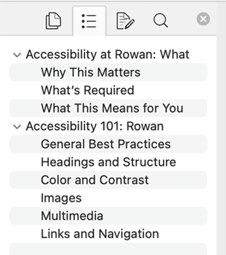
Remember, font type does not indicate heading type. Once a heading is set, you can change the font. To set a preferred font style, right click right click a heading level, click modify and set your preferred font and alignment. You can also select all instances from this menu to change all the fonts of one heading level in a document at once.
Google Docs
- Use the Styles dropdown in the toolbar (labeled “Normal text”). (See Figure 10)
- Apply logical heading structure Heading 1 (main sections) → Heading 2 (subsections) & so on.
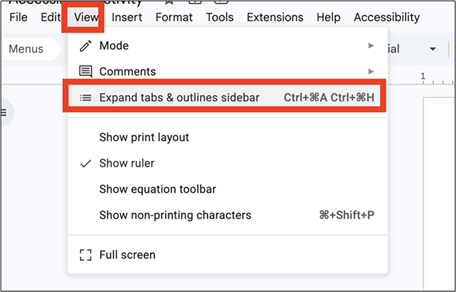
- Select View → Show Outline to review the document structure.
The document outline shows how screen readers and other assistive technologies interpret your headings.
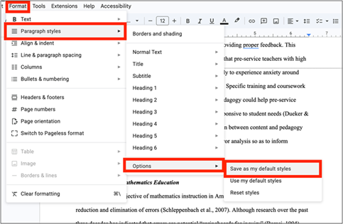
To save your font preferences in Google Docs, you first up format the text in your document and can then apply that to future documents.
- Format the text: Highlight a heading in your document and change its font, size, color, or spacing.
- Open the Styles menu: With the text highlighted, click the Styles dropdown
- Update to match: Choose the heading level you want to change Click the arrow next to that heading level and select Update 'Heading X' to match. Now all that heading will be updated to that style.
- Apply style as default: Go to Format → Paragraph styles → Options and Save as my default styles
PowerPoint
- Use built-in slide layouts such as Title Slide or Title and Content.
- Treat each slide title like a heading and ensure every slide has one.
- Use View → Outline View to review the slide structure.
- Avoid repeating the same slide title multiple times.
Slide titles help screen reader users navigate between slides.
Canvas (Rich Content Editor)
- Use the Paragraph dropdown menu in the editor toolbar.
- Select Heading 2 for main sections within the page.
- Use Heading 3 or Heading 4 for subsections.
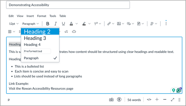
Note: Canvas automatically uses Heading 1 for the page title, so content within the page should begin with Heading 2.
Resources
Tables
Tables organize information into rows and columns so readers can easily compare and understand data. When tables are structured correctly, they help both sighted users and assistive technologies interpret how information relates across rows and columns.
General Information
- Use tables only for structured data, not for visual layout.
- Assign a header row and/or header column so each data cell has a clear label.
- Keep table structures simple.
- Avoid merged cells whenever possible.
- Do not use images of tables.
- Add a caption or title when the table needs additional context.
Microsoft Word
- Insert a table using Insert → Table.
- Select the table and open the Table Design tab.
- Check the Header Row option.
- Right click table to access alt-text.
Table Design Menu with Header Row Options:

Table Properties with Access to Alt-text:
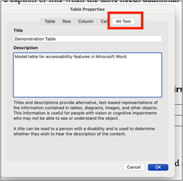
These settings help screen readers identify headers and announce them when navigating the table.
Google Docs
- Insert a table using Insert → Table.
- Right click → Table Properties → Row (identify header row)
- If additional context is needed, place a caption above or below the table.
Canvas (Rich Content Editor)
- Insert a table using the Table tool in the Rich Content Editor.
- Enter headers in the first row of the table (Table → Row → Row Properties (identify header row).
- Caption is required to pass accessibility scan
- Avoid using tables for page layout.
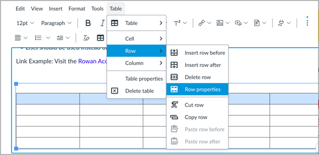
Dos and Don’ts
Do:
- Determine if a table is best way to present information
- Identify header rows to help screener readers navigate the table
- Add title/caption to provide context
Don't
- Merged cells: These can break the relationship between headers and data.
- Blank header cells: Every column or row should have a clear label.
- Nested tables (tables inside tables): These create complex navigation problems.
- Images of tables: Screen readers cannot interpret images of text.
Resources
Color Contrast and Readability
Color contrast refers to the difference in brightness between text and its background. Good contrast makes digital content easier to read for everyone, including people with low vision, color blindness, or those viewing materials on projectors, mobile devices, or in bright environments.
Contrast between colors is measured as a ratio ranging from 1:1 (no contrast) to 21:1 (maximum contrast). To meet accessibility guidelines:
- Normal text must have a contrast ratio of at least 4.5:1
- Large text (18pt or larger, or 14pt bold) must have a contrast ratio of at least 3:1
- Color contrast can be assessed on WebAIM Contrast Checker.
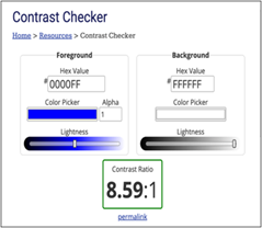
General Color Contrast Guideline
- Use dark text on light backgrounds or light text on dark backgrounds.
- Avoid gray text on white backgrounds, which often fails contrast standards.
- Use solid background colors instead of patterned or busy backgrounds.
- Avoid placing text on top of images.
- Avoid very thin fonts that reduce readability.
- Do not rely on color alone to communicate meaning, especially in graphs.
Some color combinations frequently cause accessibility issues:
- Gray text on white backgrounds
- Light blue hyperlinks that are difficult to see
- Text placed over background images
- Low-contrast buttons or form fields
- Using color alone to indicate status or emphasis
Quick Fixes
Small adjustments can dramatically improve contrast:
- Darken text colors or lighten backgrounds.
- Replace bright red text with dark red when possible.
- Underline links instead of relying only on color.
- Pair icons with text for important actions (for example: ✓ Complete).
- Add borders or outlines to buttons with low contrast.
Recommended Font Sizes
Minimum readable sizes will vary depending, but these guidelines work well for most digital content:
Documents (Word, Google Docs):
- Body text: 11–12 pt minimum
- Headings: 14 pt or larger
Presentation Slides:
- Body text: 24 pt minimum
- Headings: 32 pt or larger
Larger text improves readability when materials are projected or viewed on smaller screens.
Recommended Accessible Fonts
Sans-serif fonts are typically easier to read on screens. Common accessible fonts include:
- Arial
- Calibri
- Verdana
- Tahoma
- Helvetica
These fonts have clear letter shapes and consistent spacing.
Resources
Multimedia
Multimedia such as videos, recorded lectures, and audio clips are common in digital learning environments. To ensure that everyone can access this content, multimedia should include text alternatives and clear descriptions of important visual information. Accessible multimedia helps students who are D/deaf or hard of hearing, supports students who process information better through text, and improves comprehension for viewers in noisy environments or when audio cannot be played.
General Best Practices (All Platforms)
- Caption all videos used in digital content.
- Review and correct automatically generated captions before publishing.
- Provide transcripts for audio recordings, podcasts, or voice-only content.
- Describe important visuals verbally when presenting charts, diagrams, or demonstrations.
Ensure multimedia content can be understood without relying on audio alone.
- Add captions to all instructional videos and recordings. Platforms such as Zoom and MS Teams can auto-generate captions.
- Review auto-generated captions to correct errors in names, terminology, and punctuation. This allows you to fix spelling, terminology, and timing issues before sharing the video.
- Ensure captions are synchronized with the audio.
- Captions benefit not only users with hearing disabilities but also viewers in quiet or noisy environments.
Zoom Guide
- Enable Live Transcript / Closed Captioning in the meeting settings.
- After the recording is processed, Zoom will generate captions automatically.
- Open the recording in Zoom (Login to web-based Zoom in if it was recorded to the cloud).
- Use the caption editor to review and correct errors
Microsoft Teams:
- Turn on Live Captions during the meeting if available.
- When the recording is uploaded to Stream or OneDrive, captions are generated automatically.
- Open the video in Stream.
- Select Edit Transcript to review and correct captions.
Tips for Improving Caption Accuracy
- Speaking clearly and at a moderate pace
- Avoiding multiple people speaking at once
- Using a quality microphone or headset
- Minimizing background noise
- Avoid recording auto-generated sub-tiles as they often have many errors and cannot be fixed by editing the transcript if recorded on the screen.
Audio Content
- Provide a transcript for audio-only materials such as podcasts or recorded discussions.
- Include speaker names and descriptions of important sounds when relevant.
Example: “Professor Lee: Today we will review the structure of DNA.”
Describing Visual Information
When presenting or recording lectures, make sure to describe important visual content aloud.
Examples:
- Instead of saying: "As you can see here…"
- Say: "This graph shows enrollment increasing steadily from 2019 to 2023."
Describing visuals ensures that students who cannot see the screen still receive the same information.
Website Accessibility
Websites are often the first-place students, faculty, staff, and community members go to find information. Ensuring that webpages are accessible helps all users, including those using screen readers, keyboard navigation, or mobile devices find and understand content.
To create accessible webpages, apply your accessibility skills to ensure it has proper structure, labels, contrast, alt-text, accessible tables and meaningful links. To help you identify potential accessibility issues, the WAVE Extension can scan a webpage and flag errors. WAVE helps identify accessibility issues directly on webpages by adding visual icons and annotations to the page. These indicators highlight potential problems such as missing alternative text, heading structure issues, color contrast problems, and other accessibility concerns.
Installing the WAVE Extension
WAVE is available as a browser extension for:
- Google Chrome
- Mozilla Firefox
- Microsoft Edge
After installing the extension, you can evaluate any webpage directly within your browser.
Using WAVE to Evaluate a Webpage
- Open the webpage you want to review.
- Click the WAVE icon in your browser toolbar.
- The page will reload with accessibility indicators displayed.
- A sidebar will appear on the left with a summary and navigation tabs.
WAVE places icons directly on the webpage so you can see where issues occur. Hover over any icon to see a description of the issue.
Understanding the WAVE Results
Summary Tab
The Summary tab provides a quick overview of the accessibility issues detected on the page. Common categories include:
- Errors (Red Box with X) Major accessibility problems such as missing alt text.
- Alerts (Yellow Warning) Items that may require review, such as unclear link text or empty headings.
- Features (Green Check) Positive accessibility features already present on the page.
- Structure (Hierarchy Icon) Structural elements like headings and landmarks.
- Contrast Errors (Red and White) Circles Text that does not meet color contrast requirements.
Details Tab
The Details tab lists every accessibility item detected on the page. For each item, WAVE provides:
- An icon matching the indicator shown on the page
- A description of the issue
- A link to the related accessibility guideline
Clicking an item highlights the location on the webpage and provides more information.
Reference Tab
The Reference tab explains each WAVE icon and why it matters for accessibility. Use this tab to better understand:
- What the issue means
- Why it affects accessibility
- How it relates to accessibility standards
Order Tab
The Order tab shows the sequence users follow when navigating the page with the Tab key. Look for a sequence that follows the visual layout of the page.
Structure Tab
The Structure tab displays the heading hierarchy and page landmarks. Examples include:
- H1–H6 headings
<main>
<nav>
<header>
<footer>
These elements help screen reader users move quickly between major sections of a webpage. Best practices include:
- Use one main heading (H1) per page
- Use H2 headings for major sections
- Use H3 headings for subsections
Contrast Tab
The Contrast tab identifies text with insufficient color contrast. The tool shows:
- The text color
- The background color
- The contrast ratio
You can click the color swatch to experiment with improved color combinations. Recommended contrast levels:
- 4.5:1 for normal text
- 3:1 for large text
Working with PDFs
PDFs are commonly used to share documents, but they can be difficult to make accessible if not created correctly. Unlike Word or Google Docs, PDFs do not automatically preserve structure unless they are properly prepared.
Accessible include:
- Headings (for navigation)
- Alt text for images, figures, and tables
- Defined reading order
- Document title and language settings
- Ensure color contrast
- Tags (document structure)
Without proper structure, a PDF may appear clear visually but be difficult or impossible to use with assistive technology. For a PDF to be accessible, it must include tags, which provide the structure that screen readers rely on to interpret the content.
What Are Tags?
Tags are hidden structural labels in a PDF that define how content is organized. They tell assistive technologies
- What is a heading
- What is a paragraph
- What is a list or table
- What is an image
Without tags, a screen reader cannot determine how the content is organized and may read the document in a confusing or incorrect order.
Best Practice: Start with the Source Document
The easiest way to create an accessible PDF is to:
Make the original document accessible first (Word, Google Docs, or PowerPoint)
Then export it as a PDF (access Adobe ribbon and Create PDF in MS Suite best results, if available)
When structure is created correctly in the original file, tags are often generated automatically in the PDF. Confirm this by running the Accessibility Checker in Adobe.
How to Check a PDF for Tags
- Open the PDF
- Go to All Tools → Prepare for Accessibility
- Select Check for Accessibility
- Open the Tags panel
Look for a structured list of elements (such as headings and paragraphs). If no tags are present, the PDF is not accessible.
Common PDF Accessibility Problems
PDFs are often inaccessible when they:
- Are untagged (no structure)
- Are scanned images instead of real text
- Have incorrect reading order
- Contain images without alt text
- Lack headings or organization
Scanned PDFs
If your PDF is a scanned document:
- It does not contain readable text
- It does not include tags
Quick Fix:
- Use OCR (Optical Character Recognition) in Adobe Acrobat
- Then review and correct structure and tags
When to Avoid PDFs
Consider using Word, Google Docs, or HTML instead when:
- Content will be updated frequently
- Students need to interact with the material
- You want the simplest path to accessibility
Note: It is sometimes faster to recreate the document in Word or Google Docs than remediate a PDF.
Social Media
Social media is part of Rowan’s digital presence and should be accessible to all users. This includes posts shared by departments, programs, and university-affiliated groups. Accessible social media helps ensure that all users can engage with your content.
When posting on social media:
- Add alt text to images whenever the platform allows
- Use clear, readable text on graphics (avoid small or low-contrast text)
- Include captions on videos
- Avoid relying on color alone to convey meaning
- Use CamelCase for hashtags (e.g., #RowanUniversity instead of #rowanuniversity)
Images and Graphics
Many users cannot see images, so descriptions are essential. Best practices:
- Avoid putting large amounts of text inside images
- Ensure good color contrast in graphics
- Ensure key information is not limited to content in an image.
- Describe the purpose of the image, not every detail with descriptive text.
Example: This photo contains key information related to the University schedule. The information shared in the image should also be in the text of the post so all users can access the information.

Videos
- Caption all videos before posting
- Review auto-generated captions for accuracy
- Ensure key information is available without sound
Links and Emojis
- Use descriptive text before links so users know where they are going
- Avoid long strings of emojis, which can be distracting when read aloud
- Note: Screen readers read the name of emojis. Be sure the emoji description aligns with the intent
- Place emojis at the end of posts, not within sentences
What About Older Posts?
Content posted before April 24, 2026, is generally not required to be updated. However, any new or updated posts, including reposts of old posts, should follow accessibility best practices.
Resources